SaaS Platform Redesign
Transforming a legacy SaaS platform into a user-friendly, scalable solution for a growing customer base
Role: Lead Product Designer
Tools: Figma, Adobe Creative Suite, UserTesting
Methods: User Research, Prototyping, Design Systems, Iterative Testing
The redesign of this SaaS platform aimed to address complex workflows, inconsistent user experiences, and limited scalability. By prioritizing user needs and business goals, I helped create a more intuitive and efficient solution that improved user engagement, reduced friction, and supported the platform’s growth.
“
Max consistently brought innovative, intuitive designs to help fulfill both business needs while solving for customer pain-points. He is collaborative and empathetic to his users, and teammates.
Jeff R.,
Visit Indiana
The Problem
The legacy SaaS platform faced significant challenges:
Complex Workflows: Users reported difficulties navigating the platform and completing essential tasks, with workflows often feeling fragmented and unintuitive.
Scalability Issues: The platform’s design and architecture struggled to accommodate the company’s growth and evolving user needs.
Inconsistent UI: A lack of cohesive design systems led to inconsistent visual and interaction patterns, creating frustration and inefficiencies for users.
These challenges negatively impacted user satisfaction and operational efficiency, hindering the platform's ability to meet its full potential.
A Little About Bandwango
Bandwango provides destinations with technology that enables the creation, marketing, and fulfillment of free and paid experiences that engage visitors and locals alike. The platform aims to drive increased foot traffic and spending at local businesses, primarily targeting Destination Marketing Organizations (DMOs) and Chambers of Commerce. This mission to support local economies and communities is at the heart of our transformation to a self-service model, making it easier for our clients to build customized passes that meet their specific needs.
Challenges
Reduce Pass Build Time: The goal was to cut the time required to build a pass from 45-90 days down to 1-21 days.
User Empowerment: We needed to enable our clients to create passes independently on an intuitive, user-friendly platform.
Understand Industry Needs: Deeply understand the unique needs of our target market, including DMOs and Chambers of Commerce, to better address their pain points and streamline their workflows.
Seamless Transition: Transition our internal teams from the old admin platform to the new system without losing critical functionality.
Our “old admin” and a long, manual Asana board, showing the complexity of building a pass before my platform redesign.
The Process
Identify the Problem
The problems were clear—lengthy build times and high operational costs were unsustainable as the company scaled.
Too many service request tickets to sustain.
Pass builds required multiple meetings and manual data entry.
2. Research:
I conducted comprehensive research through interviews with key internal stakeholders, including the C-Level team, Customer Success, and Operations.
Conducted interviews with 15 power users to uncover pain points, revealing that 40% found navigation unintuitive and 30% experienced frequent task delays due to fragmented workflows.
Analyzed customer feedback and platform analytics to identify high-impact improvement areas.
Benchmarked competitor platforms to gather insights into best practices and potential differentiation opportunities.
3. Ideation
Developed multiple design concepts for key workflows, focusing on simplifying user tasks and creating a consistent experience across modules.
Facilitated workshops with stakeholders to align on priorities and gather feedback on early ideas.
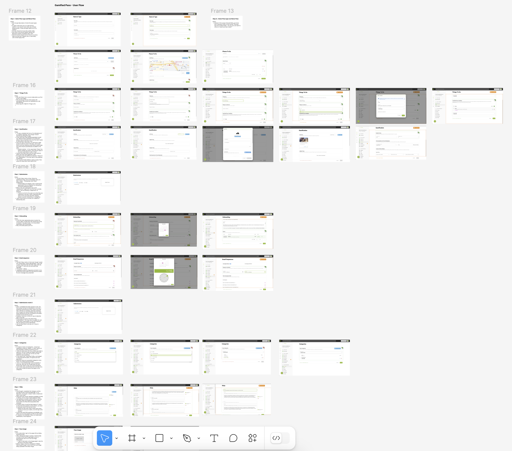
4. Wireframes & Iterative Design
Created wireframes and low-fidelity prototypes to explore user journeys and test design hypotheses.
Built a modular design system in Figma, ensuring UI consistency and scalability for future iterations.
Designed high-fidelity mockups emphasizing usability, accessibility, and aesthetic appeal.
Iterative Dashboard Designs
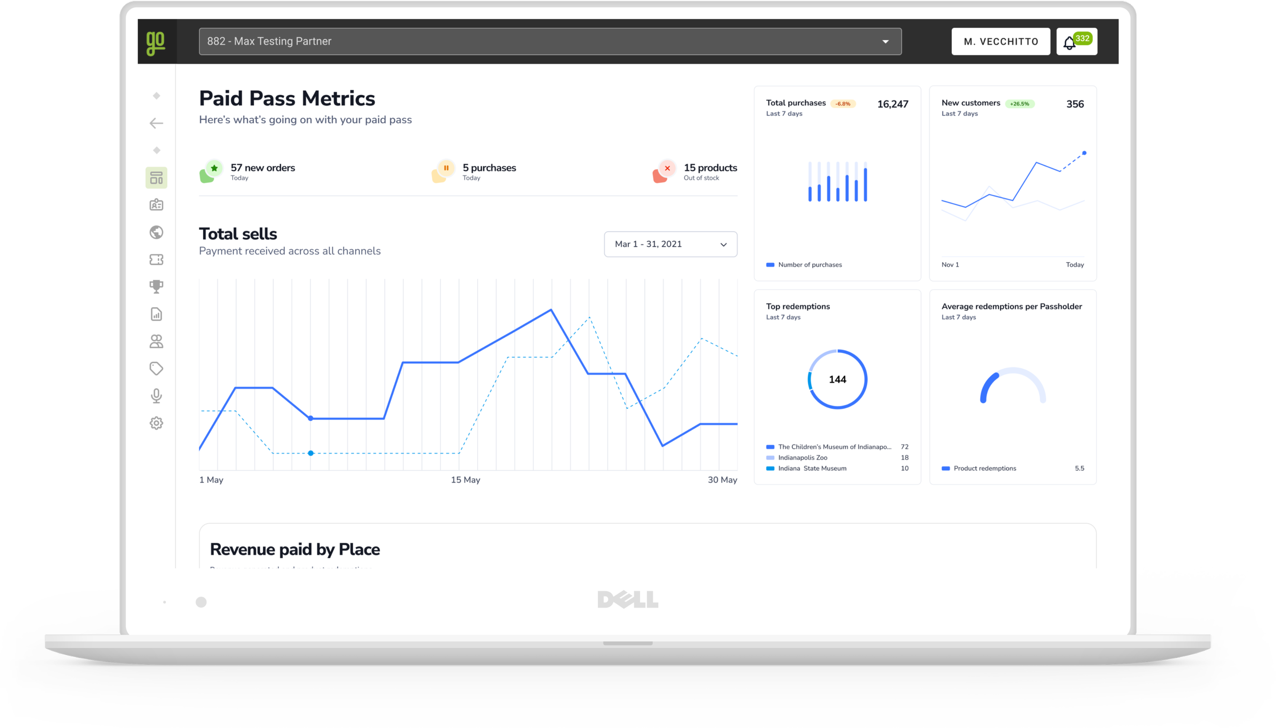
The redesigned dashboard was a cornerstone of the SaaS platform overhaul, serving as the primary interface for users to access key information and workflows.
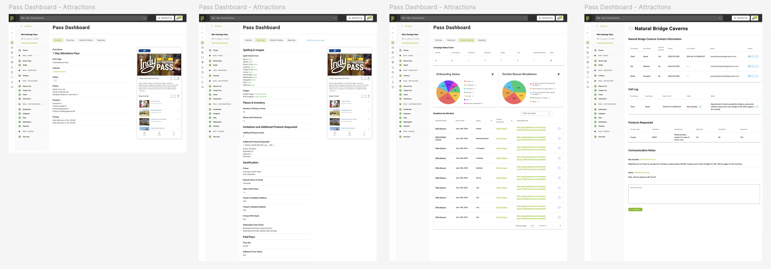
Iteration 1: This tabulated Pass Dashboard provided different actionable tabs, depending on what the client needed to check out. However, upon user testing, it was reported to be too busy and cumbersome. Feedback heard!
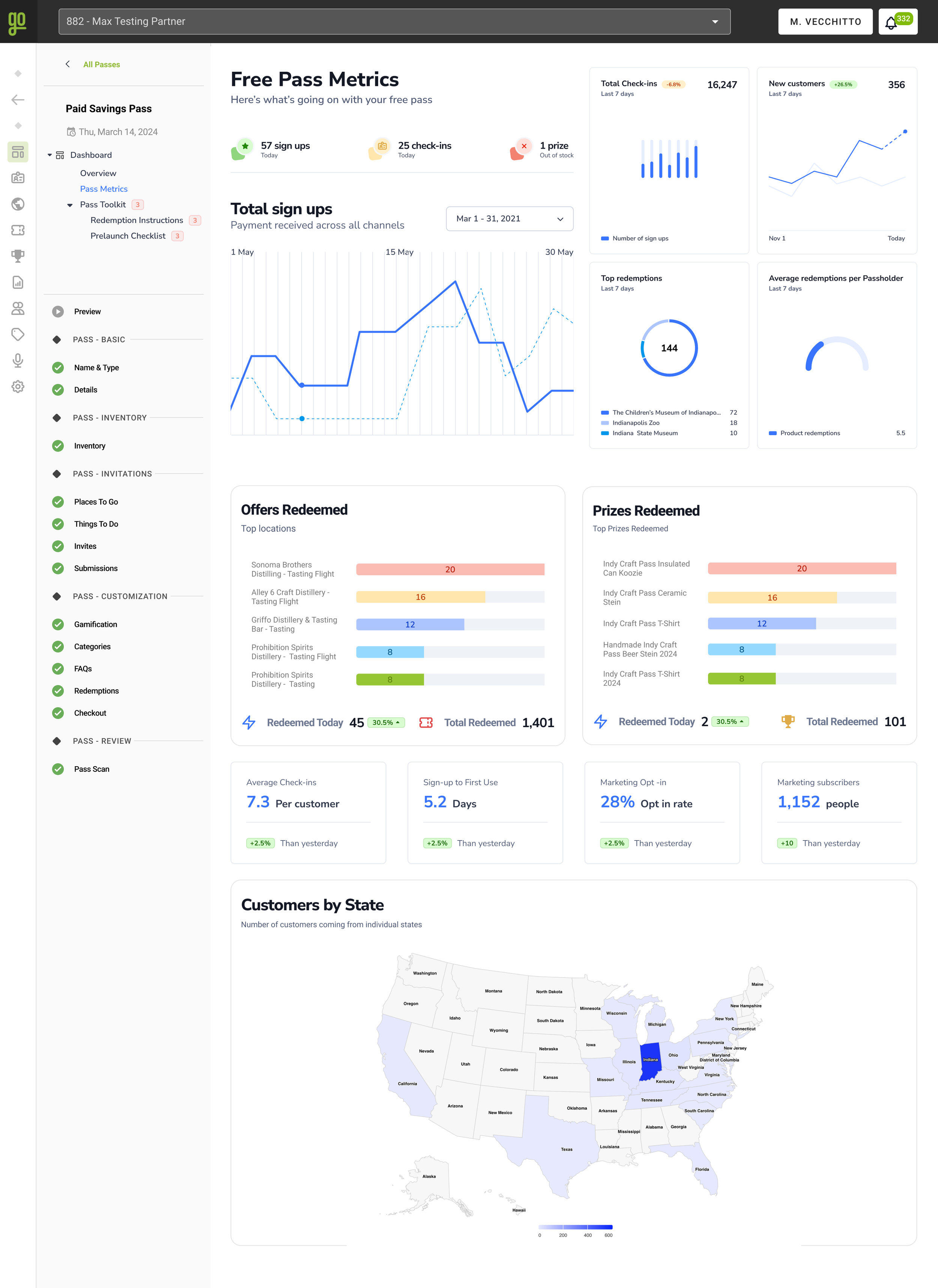
Iteration 2: The updated design was more visually engaging and included the KPIs clients wanted to track for their passes. However, feedback revealed that clients still lacked a comprehensive view of their pass performance. Additionally, although the ‘Share’ link was initially requested, user testing showed it felt out of place on the dashboard, prompting reconsideration of its placement.
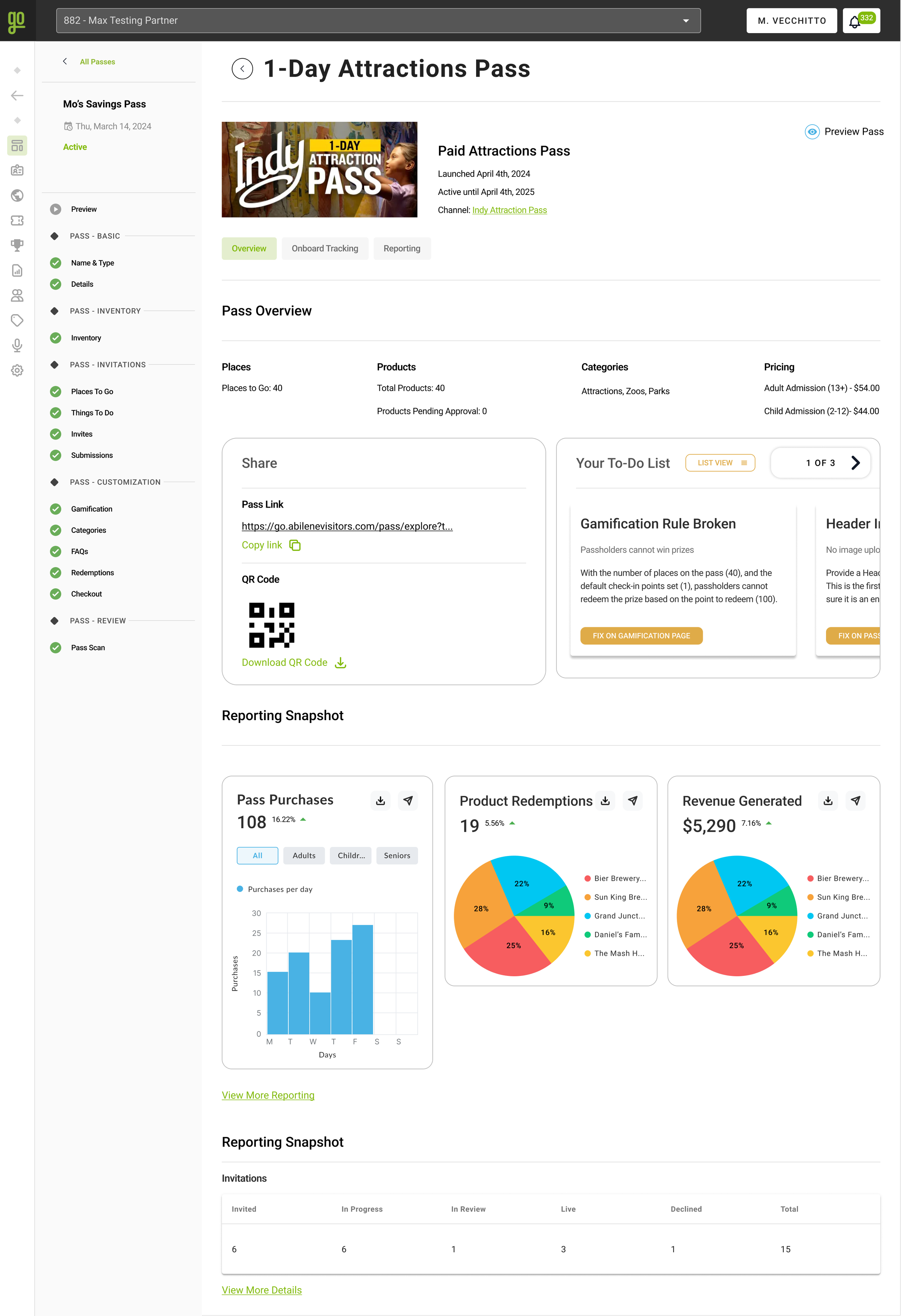
Iteration 3: Following two rounds of user testing on the Pass Dashboards, the third iteration successfully met all acceptance criteria gathered from clients and product managers while achieving a visually appealing design. It provided the key insights clients needed to effectively monitor their pass performance. This version was included in our product release, featuring refined micro-animations and hover effects to enhance the user experience.
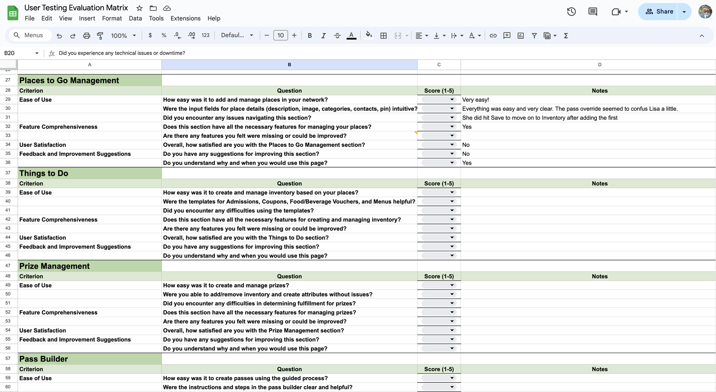
5. Testing
Conducted usability testing with 20 users, iterating on designs based on feedback.
Measured improvements in task completion times, reducing them by 25% compared to the previous platform.
6. Implementation Support
Collaborated closely with engineers to ensure seamless design handoff and adherence to the new design system.
Provided interactive prototypes and detailed documentation to facilitate development.
The Solution
The redesigned SaaS platform delivered:
Streamlined Workflows: Simplified navigation and optimized user journeys reduced friction and improved task efficiency.
Scalable Design System: A cohesive set of UI components and patterns ensured visual consistency and supported future platform growth.
Improved User Experience: Accessible, user-centered designs made the platform easier and more enjoyable to use for all users.
Additional Solutions
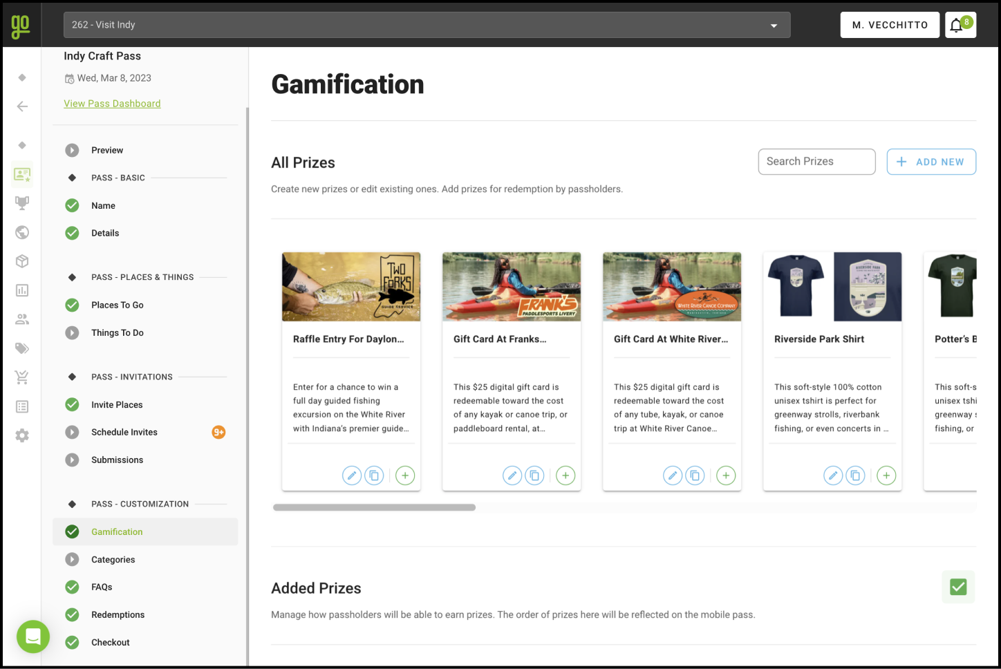
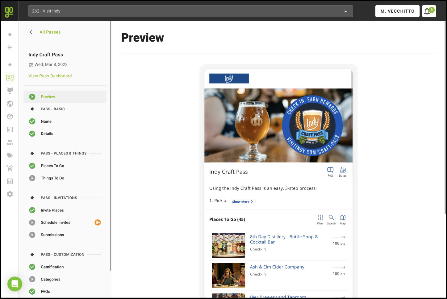
Self-Guided Pass Builder: Empowered clients to efficiently create passes using templates and automation, significantly accelerating the build process.
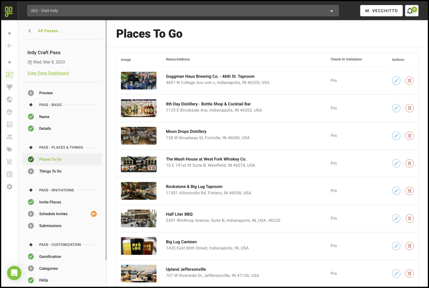
Reduced Data Entry Time: Integrated Google listings to streamline business additions, reducing data entry from hours to just minutes.
QR Code Redemptions: Addressed user challenges with check-ins by introducing QR code scanning, simplifying the process for both users and business owners.
In Pass Voting: Designed a ranked voting feature for users to highlight their favorite locations, fulfilling client requests for enhanced engagement.
Availability & Scheduling: Developed a booking feature allowing users to schedule attractions and check availability, ensuring a seamless planning experience.
Real-Time Dashboards: Created actionable dashboards delivering insights on metrics such as sign-ups, demographics, check-ins, and ROI, enabling data-driven decisions.
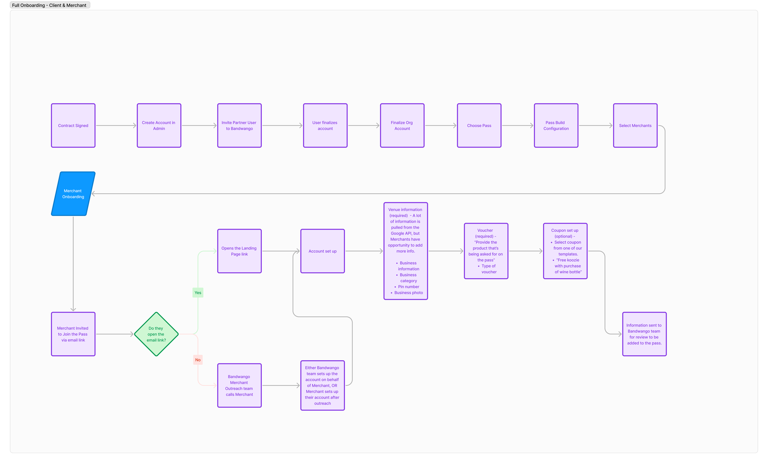
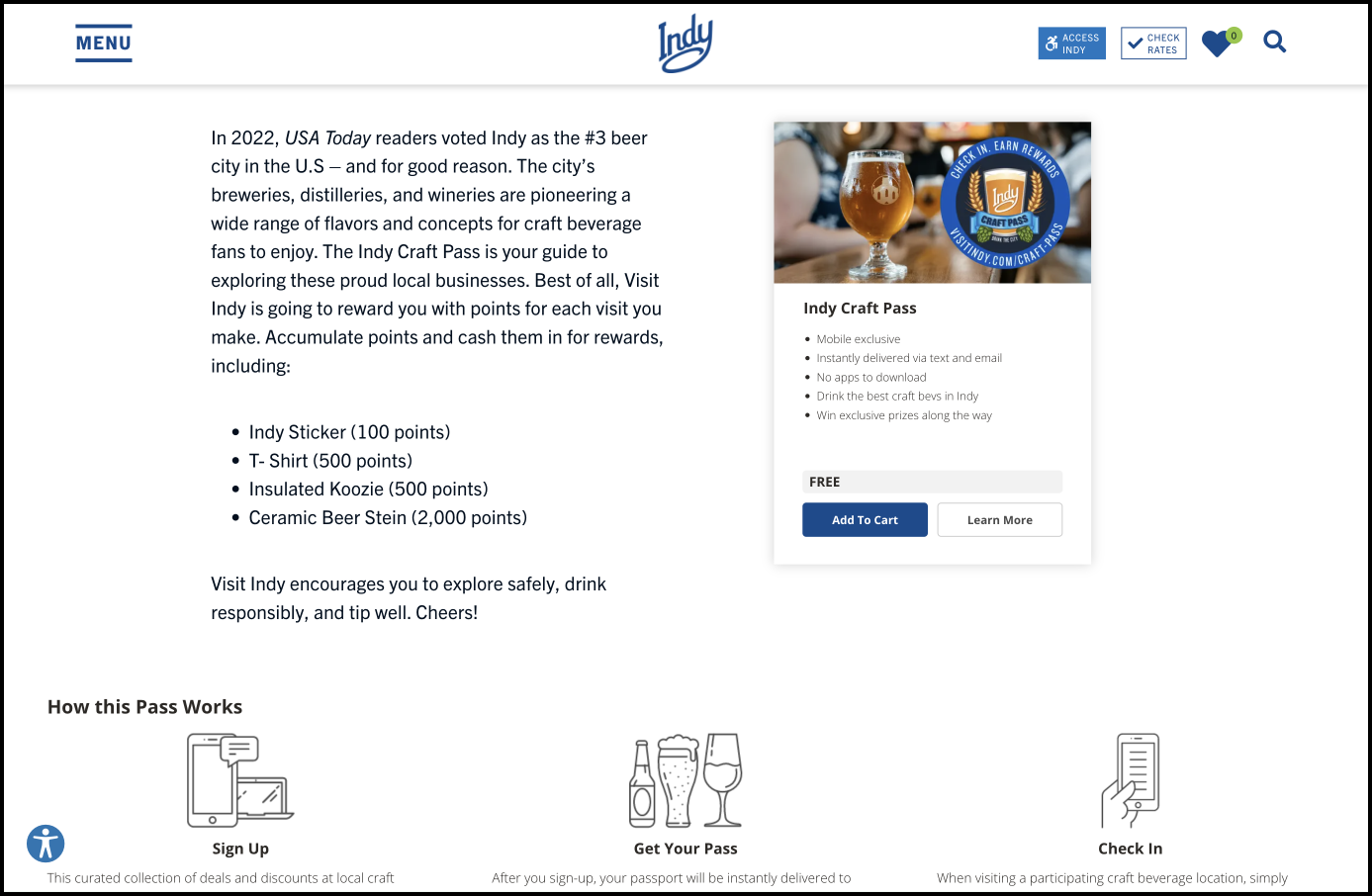
Once clients successfully create a Pass on the Pass Builder platform, they integrate it into their website to promote it to their audience. End-users can then sign up for the pass directly through the site. After registration, users gain immediate access to their pass, which they can use to explore and engage with participating local businesses. This streamlined process not only drives engagement but also ensures a seamless experience for both clients and end-users, enhancing participation and local business support.Results
The redesign achieved measurable impact:
Achieved a 90% increase in user task efficiency by streamlining workflows.
15% increase in user engagement, driven by more intuitive workflows and enhanced usability.
27% conversion rate for the primary call-to-action, demonstrating the success of the redesigned user flow in driving key outcomes.
Enhanced scalability, enabling the platform to better support a growing user base and evolving business needs.
What I Learned / Key Takeaways
Balancing Scalability and Usability: This project reinforced the importance of designing for both immediate user needs and long-term growth. Developing a modular design system ensured scalability without sacrificing functionality.
The Power of Data-Driven Design: Leveraging user interviews, analytics, and usability testing highlighted the value of iterative design. Data-informed decisions led to tangible improvements in user satisfaction and efficiency.
Collaborating Across Teams: Partnering with product managers and engineers deepened my appreciation for cross-functional collaboration. Clear communication and alignment were key to delivering a cohesive solution.
Driving Business Impact Through Design: The 27% conversion rate for the redesigned CTA and increased user engagement underscored how thoughtful design can directly contribute to business goals.
Iterative Problem-Solving: Constant iteration and testing demonstrated the value of refining ideas based on user feedback, leading to a more seamless and impactful end product.


