Client: Love My Air in association with the City of Denver
Expanding user base & engagement through UX Research and Audit
Problem Statement:
Citizens of Denver need a way to quickly and easily access high-quality information about Air Quality to avoid negative consequences of poor air quality because currently it is hard to find information that is not only accurate and precise, but actionable and timely.
Challenge
Love my air app was designed specifically for Educators and Nurses to educate their students and patients, respectively, about the implications of poor air quality. After a successful launch of the beta app to these User groups, the Love My Air team wanted to expand the reach of the app to the general public of the City of Denver.
Methodology
User interviews
Conduct 10 user interviews, sourced through UserInterviews.com, each interview being about 30 minutes long. We followed a set of interview questions to glean insights and commonalities of interviewees as to what their general awareness and knowledge of air quality, and how they currently found this information in their day-to-day life.
Surveys
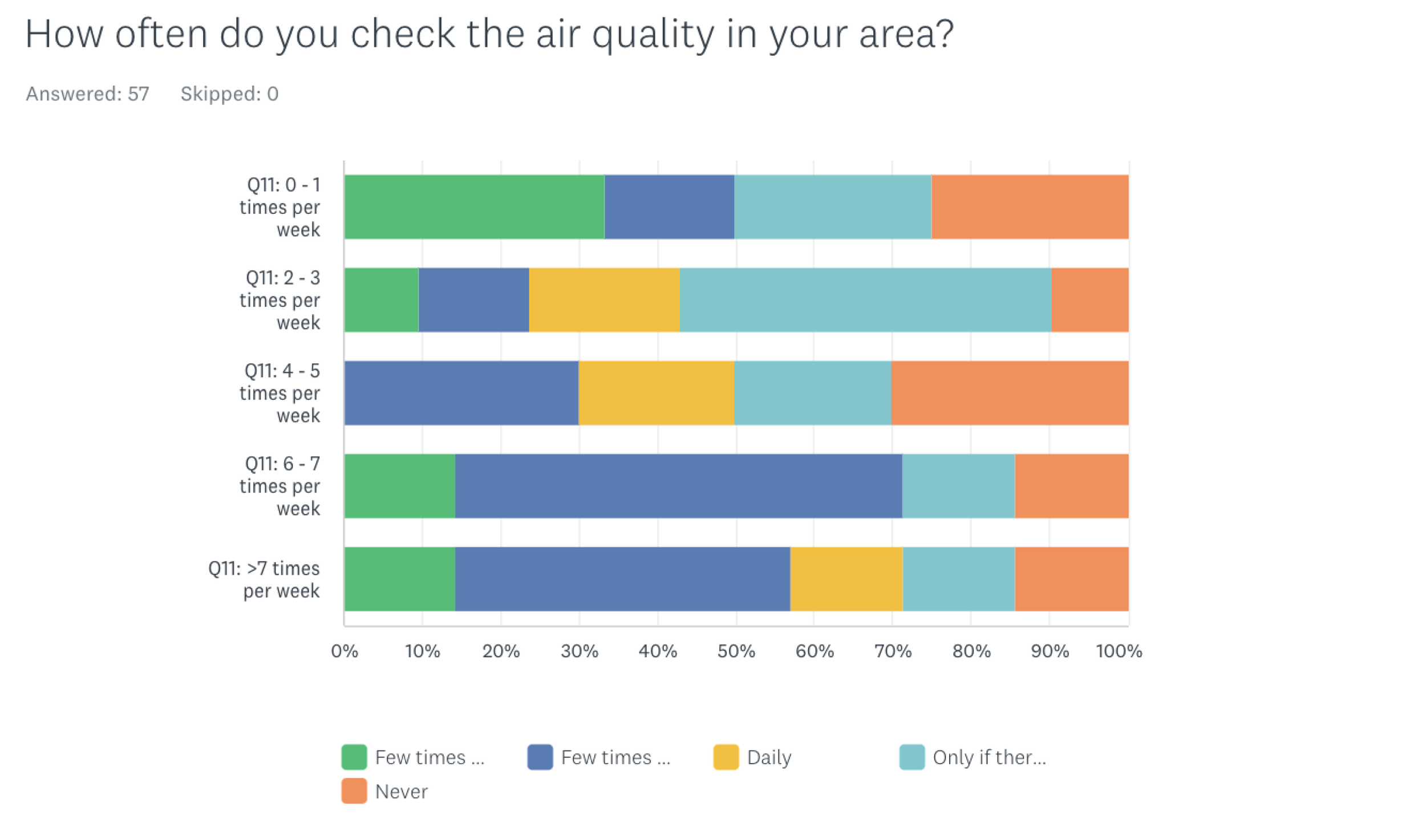
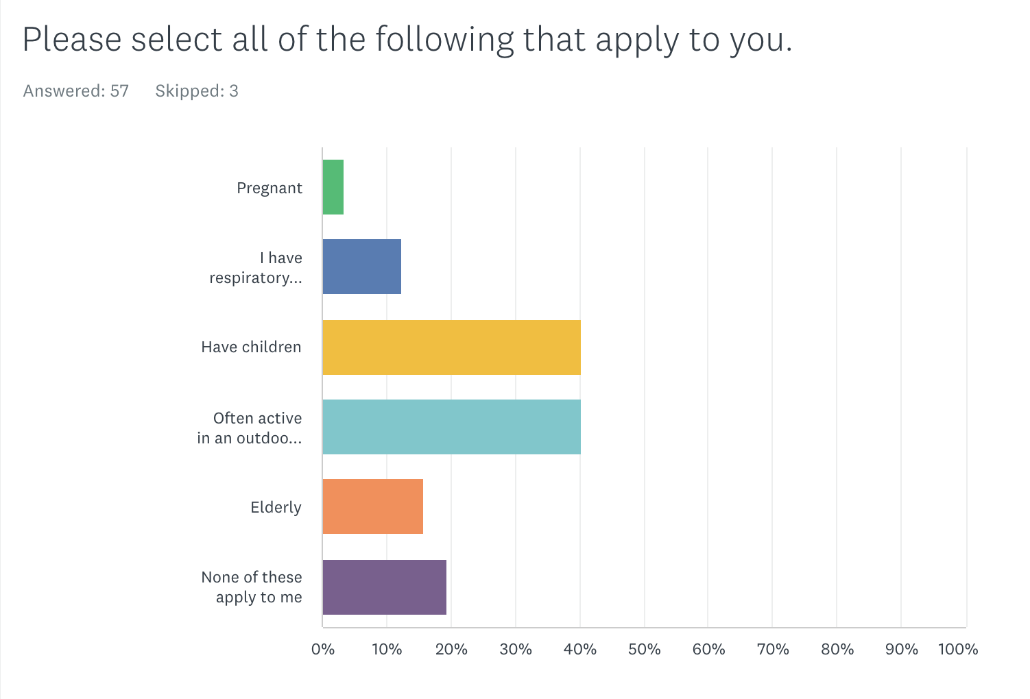
50 user surveys set up and conducted through SurveyMonkey.com. Set up survey to include general demographic information, Air Quality literacy and knowledge, and needs, wants, desires for what they look for in an Air Quality app.
Synthesis:
User interviews:
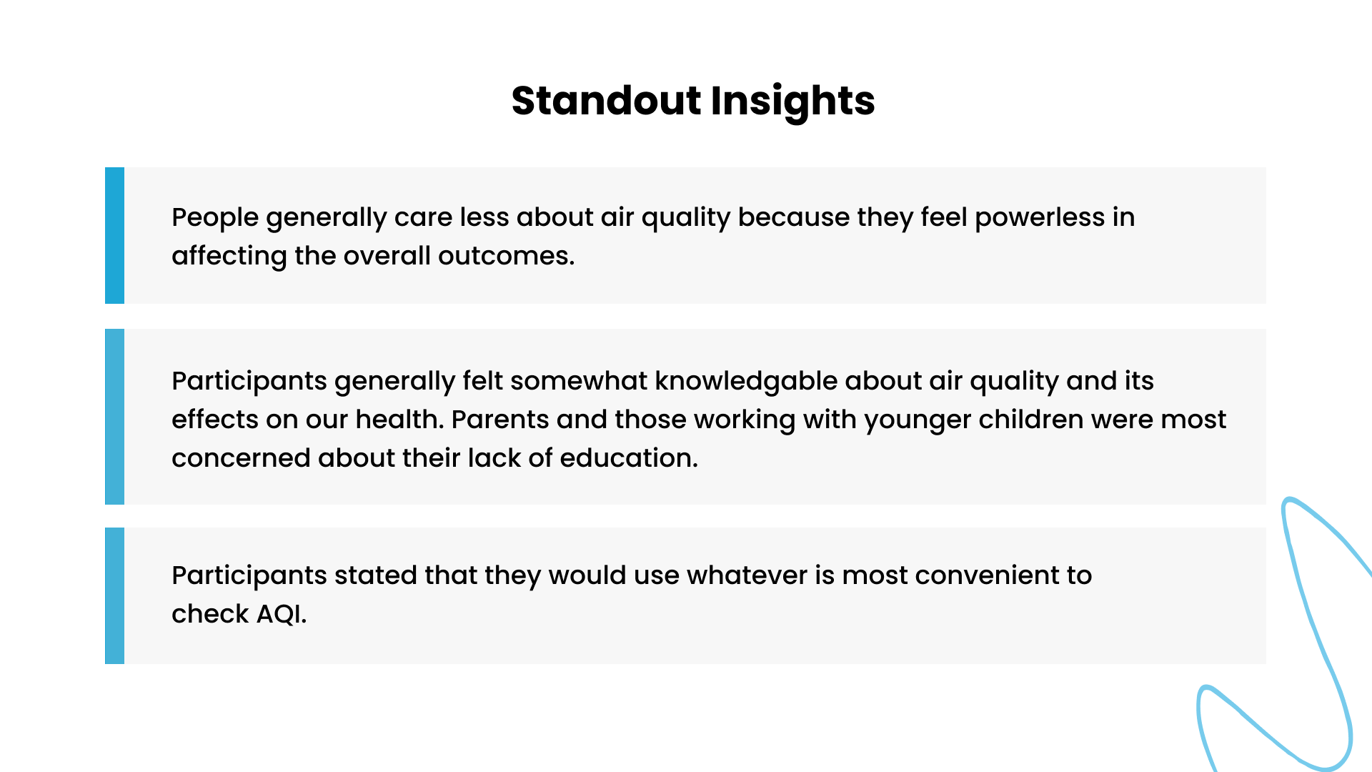
After conducting user interviews, we synthesized the results by organizing verbatim quotes and mapped them against common themes. This helped to determine what the common needs were from the general Denver public on what would resonate with them for an Air Quality app that they would use.
Surveys:
After the results from the surveys were submitted, we analyzed the commonalities and relationships of the answers to determine patterns and common needs from the users surveyed through Affinity Mapping. We found a lot of interesting trends that were used in our suggestions for designs for the app.
UX Audit
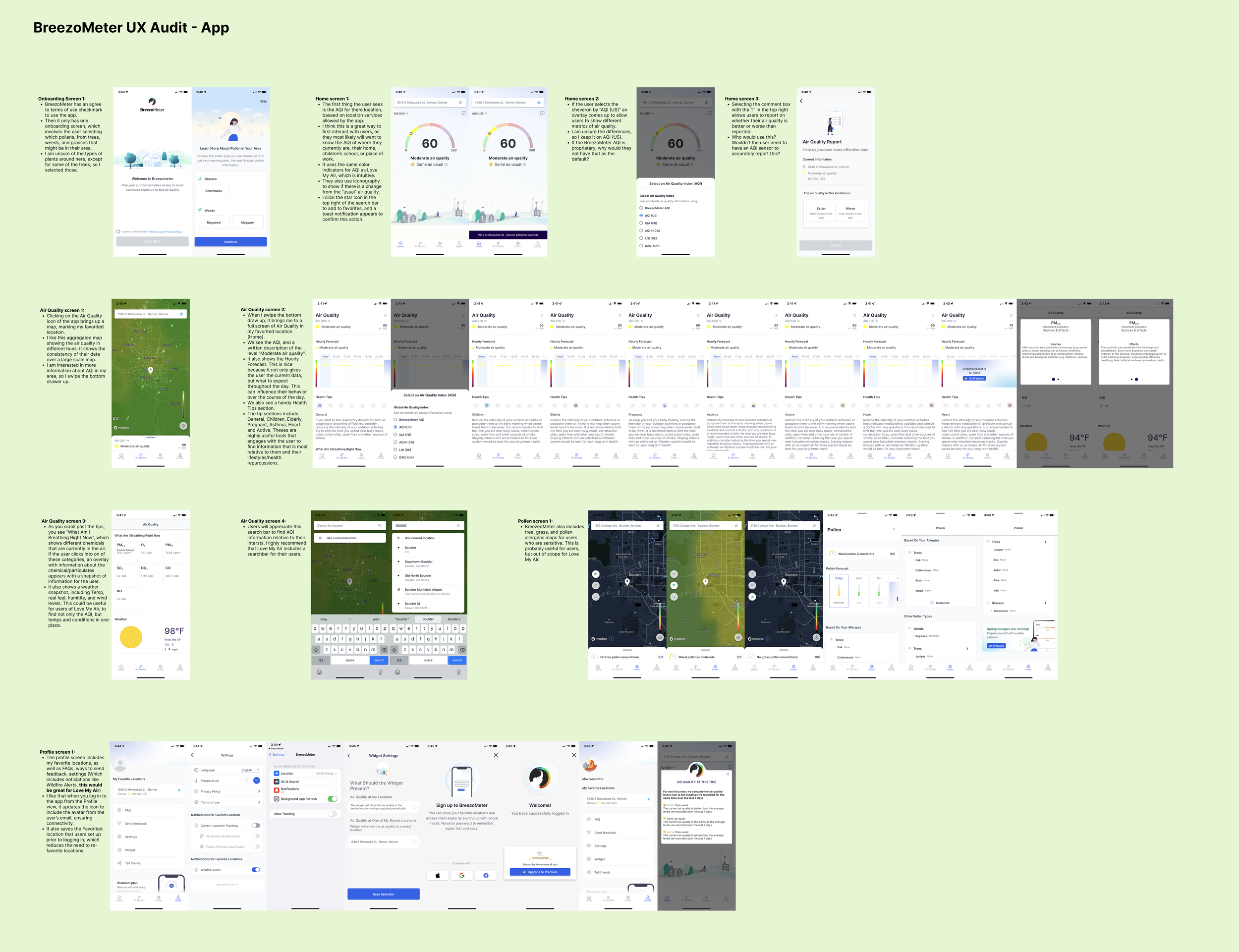
While interviews and surveys were conducted, I did a comprehensive UX audit of the Love my Air website, app, as well as their competitor’s apps. Screen by screen, from onboarding to settings I made note of UX/UI improvements that could be made. I validated my UX audit with the results of the surveys and interviews.
Findings:
What most people valued in an Air Quality app:
Convenience
Actionable insights
Additional metrics outside of AQI
User-group Specific suggestions
Most people (>80%) of people surveyed used Apple’s Weather app to check their AQI (Air Quality Index), because they were familiar with the Weather app, and it was easy to scroll down and quickly find out whether the AQI was at a healthy level or not. Users also wanted to be told what to do based on the AQI. If Air quality was great, they wanted the app to suggest that they can go outside, and if air quality was poor, users desired to trusted suggestions for how to mitigate air quality effects for themselves and family, along with suggestions for how to improve the app.
Recommendations for Client:
Remove language selection view in onboarding.
Condense the carousel info into a single view.
Add clear, succinct information why a user should ‘Choose a Partner’, who the partners are and how it directly relates to the user.
Expand on the tell us about yourself options as user roles and how they identify is expansive. Consider a dropdown list.
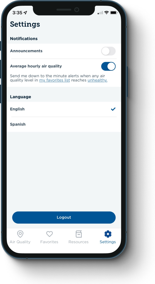
Expand notification types to include actions that can be taken based on AQ conditions and set default AQI alerts.
Add human explanations over acronyms such as PM & AQI.
Consider writing out air quality with AQI in parenthesize.
Turn all in application PDF’s into parsed images and words to improve accessibility for users.
Remove links that take the user out of the app experience.
Add the ability to share air quality information externally via a templated text or email.
More Opportunities for the App
1) Improve customization for user groups so they have specific alerts based on their needs.
2) Improve onboarding experience, specifically with the partners page selection.
3) Allow users to “locate themselves” on app, and add search bar for users to find specific addresses.
Change air quality data location selection to a preferred best practice experience of allowing the user to select the areas they are interested in from a map.
Default to the map view and make air quality list view secondary.
Add a search bar to the map view.
Add clear information on how to contact or communicate within the app.
4) Provide insights on actions users should take based on AQI level or needs specific to users (pregnant, asthmatic, outdoor active, etc).
5) UI adjustments to sensor cards to better indicate it is a carousel with valuable information for users.
UX Research
Our intention is to understand the general publics understanding of Air Quality, and how it effects everyday life. This understanding led to our synthesis of true user values backed by user research, which provided suggestions for interaction and usability improvements.
We also provided feedback for improvements on accessibility updates for the app.
Next Steps
After creating a deck with our findings and suggestions, we also provided a list of feature updates for both UI and UX improvements to best solve the problems that general users have with an Air Quality app. We prioritized the features by both importance and level of effort to implement. We also provided a list of bugs that we experienced during the audit to escalate to their dev team. Our efforts was able to identify several elements that could easily be implemented to improve user experience, and the Love My Air team will have a ranked list of features to implement as funding is secured.


